


Project: Interior design for a living room, Oegstgeest
Key words: Cosy, warm, inviting, comfort, color, 60’s / 70’s vibe
When you enter the living room, located on the second level (first floor, Dutch standard)of this house, you see a long open space. The space is perfect for a large dining room table. The table can seat many more than the family of four that live here, and it’s perfect for eating together with friends – which is something this family loves to do. However, using up this space for the dining area meant the seating area had to be – well, crammed – into a small ‘box-like’ space, around the corner of the room (see drawings below).
The furniture in the seating area was from the family’s previous house. Among them, a three-seater sofa which was perfect for the old home, but too massive for this one. They had a big coffee table which was perfect for the kids when they were growing up (having been good for hours and hours of play) but was ready to ‘move on.’
The Scope
Most importantly: it had to become cozy. But being a family with two young teens, they also needed more places to sit, including places to read. They wanted a new, less austere, sofa and a new area rug. As for the coffee table: they preferred to have an open space so the boys, if they wanted to, could hang out on the floor and watch tv. Another important element was that the tv should be placed in a less conspicuous place. Finally, they asked for more color in the room… say no more!
The Floorplan
The first step in transforming this living room was to look at the floor plan. The space where the seating area felt like a box. It all has to fit in there, or does it? I was asked to ‘think outside the box’ and so I literally extended the seating area into the larger part of the room, and yet keeping it whole by using the area rug and second sofa.
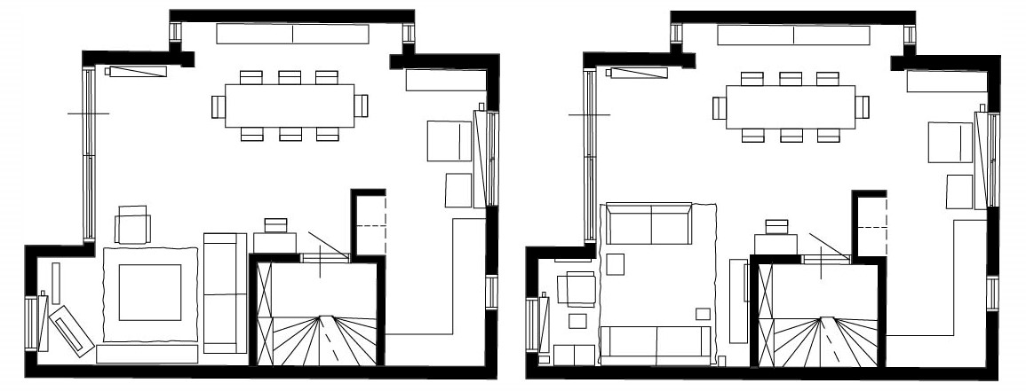
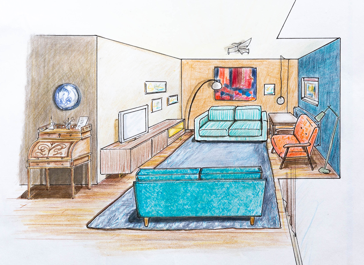
The new layout ensures that the television is in a less prominent spot. I placed it on a (new) low-board, set against the left wall. Although the tv is no longer a central focal point in the room, it can easily be seen in the seating area. The vintage chair, right, sits behind a little wall, making this a lovely reading nook.
New Colors and Furniture
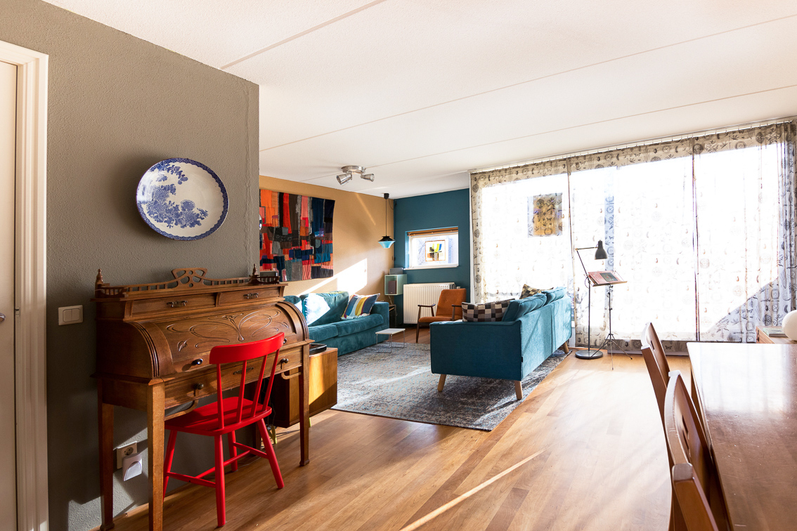
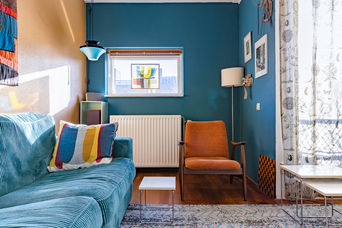
Inspiration for the color scheme was easily found in the residents’ art collection. The two new sofa’s are similar in color but different in style so as to avoid being too ‘matchy-matchy.’ They are both from Trendhopper. With a range of 100 fabrics, you can certainly find the upholstery fabric you are looking for.
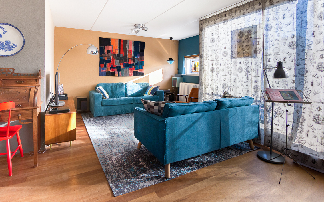
The back wall, in the picture above, was painted in a Flexa color called ‘Caramel Fudge.’ Sounds yummy. Being a similar color to the floor, it elongates the floor, and thereby the space. It is a nice backdrop to the tapestry that is hanging there and it also sits well against the deep petrol blue on the wall to the right.
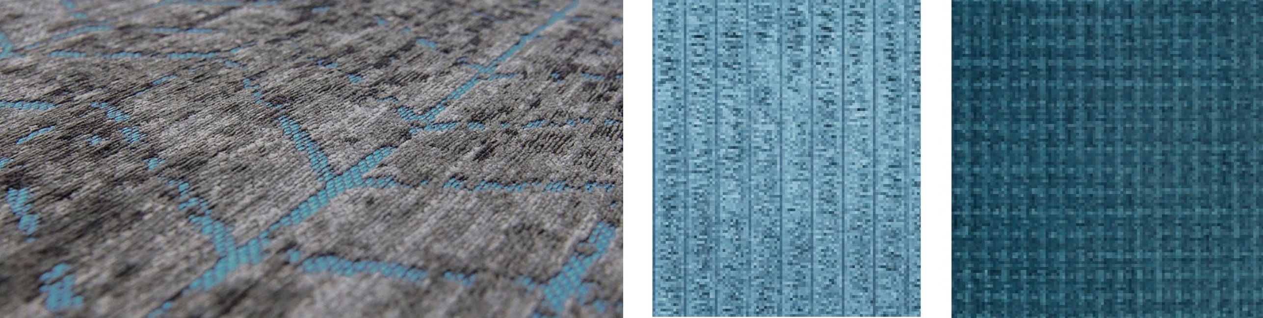
The large 230 x 330 cm, dark blue, area rug goes by the name of Mad Men (Louis de Poortere). It has light blue detailing and it is soft enough for the kids to chill on (lekker chillen :-).
Vintage
I incorporated three vintage elements in this design: an orange 60’s Webe Louis van Teeffelen teak armchair, found at Barbmama; a set of 3 white ‘nesting tables’; and a hang lamp made from two up-cycled vinyl records.
Speaking of vinyl records: for the turntable and speakers, I ordered four Cubit elements in different sizes and soft colors. Two of them hold the turntable and the other two are hung on the walls and hold the speakers.
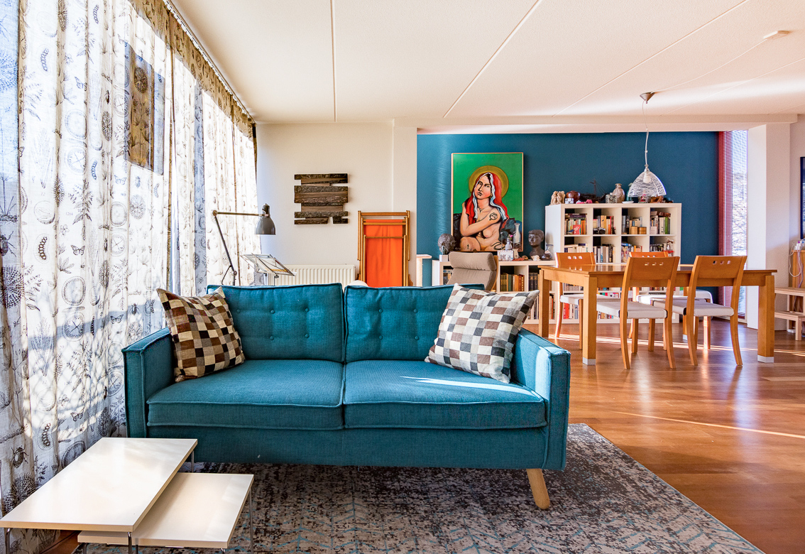
The wall behind the dining room table was white before. We gave it extra depth by painting it in a petrol color. This makes a beautiful backdrop for the art and the books there.
Would you also like an interior design for your own home? Have a look at my services, or contact me directly, so we can discuss the possibilities in person.